| | school stuff pt. 2 |  |
|
|
| Author | Message |
|---|
Cath

Number of posts : 272
Registration date : 2008-08-12
| | Subject: school stuff pt. 2 Sun Feb 08, 2009 12:17 am | |
| this semester: Life Drawing 1 Fine Arts Photography 2 Likely lots of drawings of naked people.. like these: 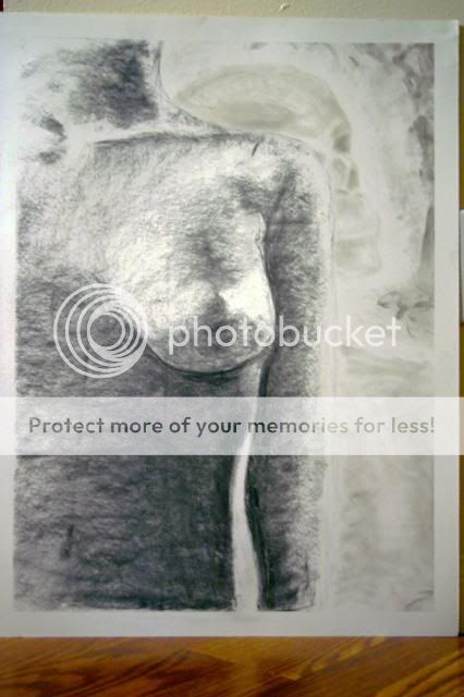 Vine charcoal from a photocopied image 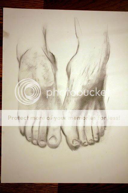 vine charcoal from a photocopied image [this one i had to do really quick.. i didn't realize it was a quick timed drawing, so i spent 5 minutes just outlining the first foot on the left, then he said we had 5 minutes left to work on it.. so i quickly added value to the left and didn't do the right. We were then supposed to finish by drawing our live models feet, but since the angles were way off I just took the rest of the 5 minutes to draw the other one from the photo]  vine charcoal from a photocopied image [that is not someone getting head.. we were told to add another drawing of an ear somewhere in it, and since i wanted to leave the right side as open contours i added the ear to the side that had already been cast in shadow and tried to pull it off as wrinkles in a curtain or something.. someone later pointed out to me during the critique that it looks like the forehead and brow.. so.. just to answer that question preemptively..]  vine charcoal from a live model 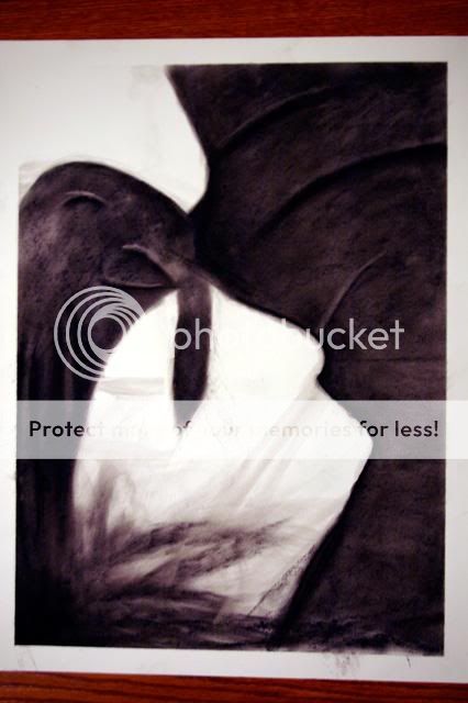 compressed charcoal from a live model [this is a silhouette.. obviously.. only the background fabric and the robe draped over her are rendered. This was done on purpose. The view is about from her shoulders with her feet in the black part. She's in a kind of fetal position. The top white protrusion is her elbow, not her breast, and the bottom two are her knees.] 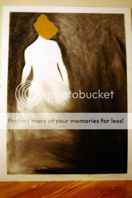 compressed charcoal from a photocopied image [This is a silhouette of Madam X. I thought this drawing was garbage, and just gave up on it because I didn't feel like messing with it any more. My teacher said it was a 'beautiful drawing'. Which isn't to brag or anything, I just thought it noteworthy that I thought it was total shit and just gave up and expected to get an equally total shit grade and ended up getting a 95 on it.] I'm aware of all anatomical errors, it's easier to see them from far away than when you're drawing it. When it's being drawn, it's not meant to be seen from that distance, but it's what looks right at that time.. so I don't notice those things until I'm standing 15 feet back from it with it hung on the wall and the tape pulled off it. I have more drawings, but they're all shit, so I didn't take pictures of them. | |
|
| | |
Maxii

Number of posts : 12
Registration date : 2009-02-07
| | Subject: Re: school stuff pt. 2 Tue Feb 10, 2009 5:51 pm | |
| Bottom two are pretty badass. | |
|
| | |
Cath
Number of posts : 272
Registration date : 2008-08-12
| | Subject: Re: school stuff pt. 2 Fri Feb 20, 2009 10:53 pm | |
| I like how photobucket decided that the two images with a guy's ass in them were inappropriate, but the close-up of a breast is acceptable. anyway, first stencil project: 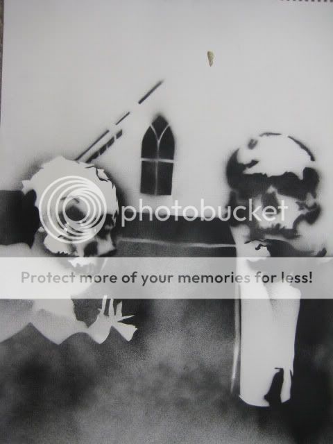 Test spray done outside at work. Stencils lightly taped down, blowing in the wind.. so it sprayed everywhere.. 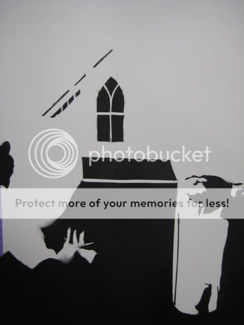 first layer 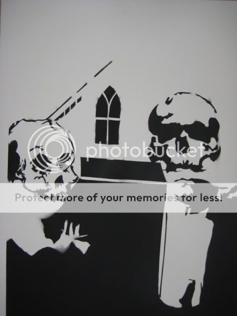 Both skulls added The man's skull is too high up and too far to the left, but I cut the stencils out on tracing vellum and had to spray mount them down to make sure they'd be flat enough to keep from getting under spray.. so when i lifted them off, they ripped. So I only got one shot at it.. i may re-cut them on some acetate so i can reuse them, but i'm also considering investing in a screen printing kit.. In case you didn't pick up on it, it's this:  | |
|
| | |
yasminspired

Number of posts : 1495
Age : 33
Location : Flawda
Registration date : 2008-08-11
| | Subject: Re: school stuff pt. 2 Sat Feb 21, 2009 6:51 am | |
| I really like the first one actually. the spray makes it look all foggy and creepy.
what was the assignment? | |
|
| | |
Cath
Number of posts : 272
Registration date : 2008-08-12
| | Subject: Re: school stuff pt. 2 Sat Feb 21, 2009 5:46 pm | |
| I liked the first one more too. The softer edges look good and inbetween them it looks like there's another face. The assignment was to create a stencil using American Gothic as the theme and put skulls in it. We also had to incorporate the word 'gothic' in it, which I didn't do. My teacher really liked it as it was but said that it looked incomplete and that adding the text in red would really bring it together. I also want to do one with this on their heads:  | |
|
| | |
tylersixx

Number of posts : 239
Registration date : 2008-08-26
| | Subject: Re: school stuff pt. 2 Sat Feb 21, 2009 5:59 pm | |
| | |
|
| | |
Cath
Number of posts : 272
Registration date : 2008-08-12
| | Subject: Re: school stuff pt. 2 Sun Feb 22, 2009 9:57 pm | |
| 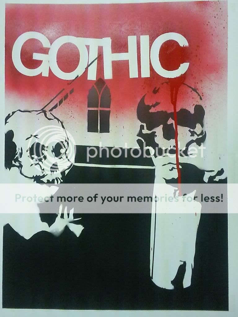 had to add 'gothic' to it so i did. | |
|
| | |
sidekick

Number of posts : 292
Age : 36
Location : Iowa
Registration date : 2008-08-12
| | Subject: Re: school stuff pt. 2 Sun Feb 22, 2009 10:52 pm | |
| | |
|
| | |
Cath
Number of posts : 272
Registration date : 2008-08-12
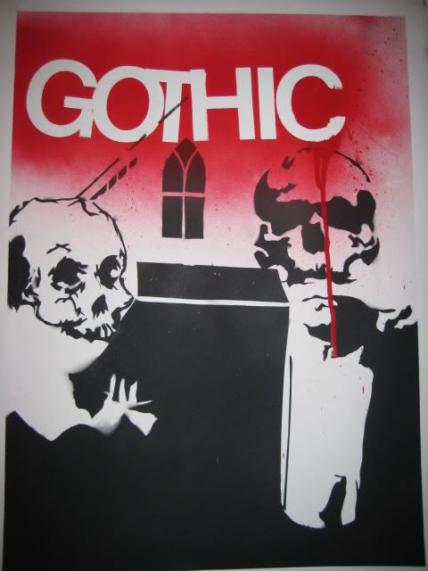
| | Subject: Re: school stuff pt. 2 Sun Mar 01, 2009 6:44 pm | |
|  better quality picture, though not necessarily a better picture. 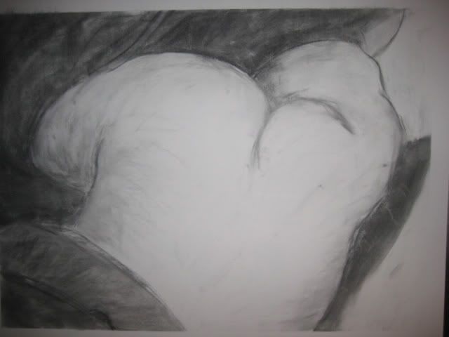 ass - covered the rest of her and just drew this. The flash kind of washed out the contrast. 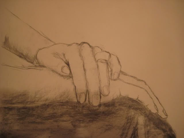 hands - i didn't really concentrate on making this a whole drawing as much as just trying to get the hands down well. 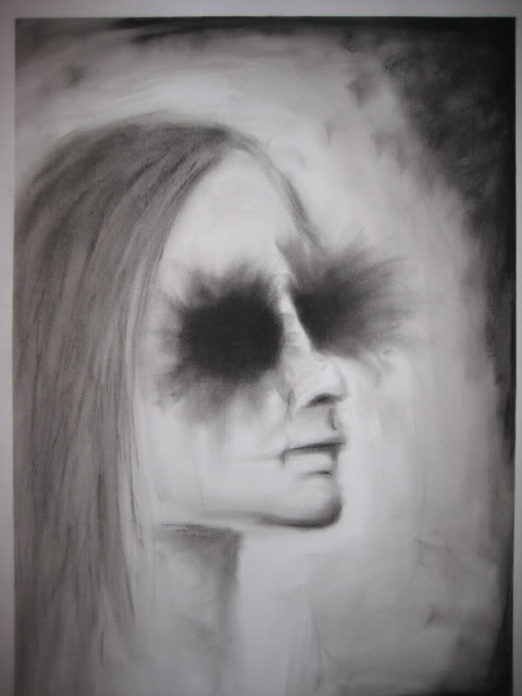 face - the eyes I did last because they looked like shit, so i tried to just cover them. My drawing teacher was keen to this and said it looked like a 'desperation move'.. but he said it still looked decent.. but he said he liked it a lot more before i did that. 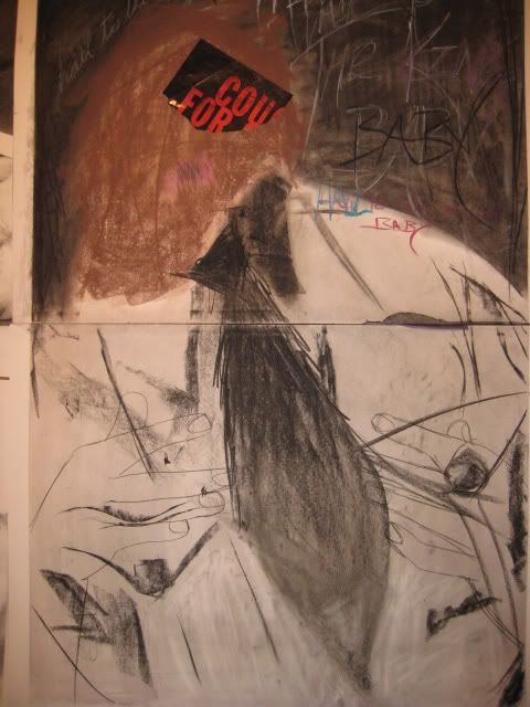 I was sick this day and really didn't feel like drawing. We had to draw the hands and then add a picture included in the handout we were given with an area of color. Since I didn't feel like drawing and felt shitty I drew this in like 10 minutes. It's a picture of Hitler (the mustache pretty much rubbed off in my bag) and the hands, and the text around the head says "Hail to the king, baby". I hated it at first, but now i actually really like this one. 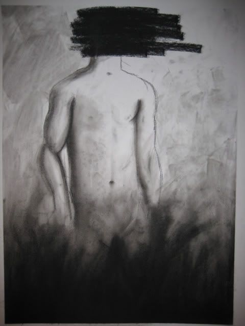 we had an old guy holding a chainsaw. The chainsaw looked like shit so i covered it with what looks like grass, and since I'm terrible at drawing heads/faces I covered that too. 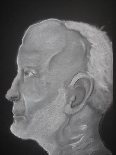 we were supposed to do an aged self-portrait. I just drew a picture of an old guy out of a book and gave him some features closer to my face. I originally drew it just like it was in the book, but then i decided to add my features more.. so i had to redraw the nose, mouth, and brow... which then lead me to redrawing the eyes and ear. The head I just couldn't get right.. it looks like shit, I may still try and fix it but i dont really want to make it worse. I drew it at work (i work at an art supply store.) and asked the other guys about the proportions and all that and one of them just started drawing all over it.. so the really bright white lines and really dark black lines are his doing, but I actually like them, so I didn't do much to them except smear them so they have the same texture as everything else. | |
|
| | |
yasminspired
Number of posts : 1495
Age : 33
Location : Flawda
Registration date : 2008-08-11
| | Subject: Re: school stuff pt. 2 Sun Mar 01, 2009 6:57 pm | |
| your final product aside, you sure do a lot of covering up of the parts you don't like. isn't that the "bullshitting" of visual art? you need to work at things to get better at them. avoiding difficulty does you no good. | |
|
| | |
Cath
Number of posts : 272
Registration date : 2008-08-12
| | Subject: Re: school stuff pt. 2 Sun Mar 01, 2009 7:52 pm | |
| i know, i'll work on them in a place where I don't have to hang them up in front of an entire classroom who, for the most part, can all draw much better than me. I can do a decent job on things if i can get a close enough look and have enough time to do so. The last drawing there I did today at work and it took me about 4 hours, my drawing class is only 3 hours and we usually do at least two drawings. In this class we also draw from live models, which is a lot harder than drawing from pictures. From a picture you can get as close as you want to it.. I can't really get in the models face to see how the light looks in the creases of her eyes, or especially if i'm drawing her chest or crotch. The picture's light doesn't change if it moves either.. if the model moves the light changes, and it fucks everything up.
I think I'm getting better though.. or at least I hope so. | |
|
| | |
yasminspired
Number of posts : 1495
Age : 33
Location : Flawda
Registration date : 2008-08-11
| | Subject: Re: school stuff pt. 2 Sun Mar 01, 2009 8:02 pm | |
| lot of excuses there matto.
I think you're getting better too. | |
|
| | |
Cath
Number of posts : 272
Registration date : 2008-08-12
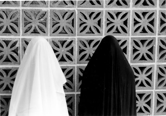
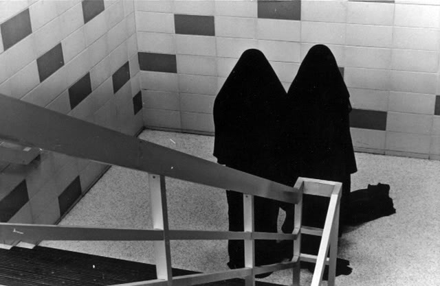
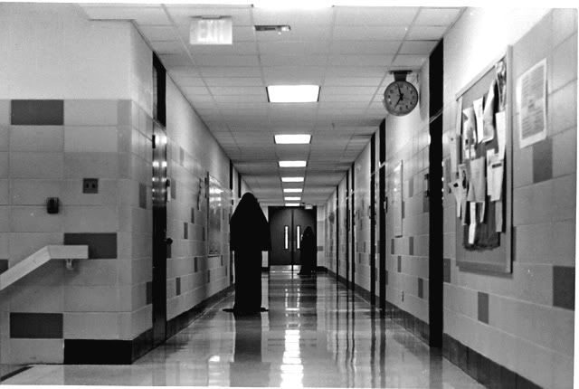
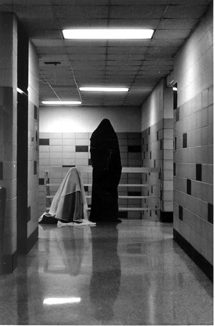
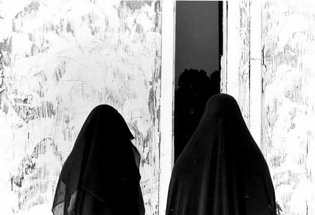
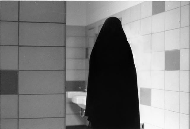
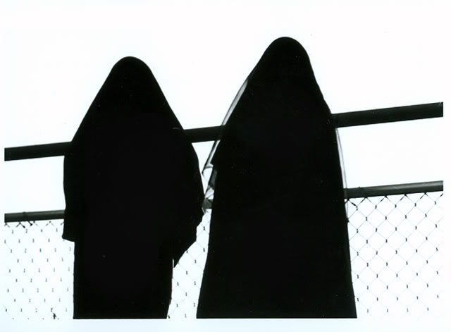
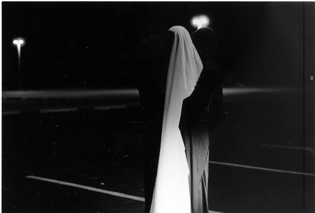
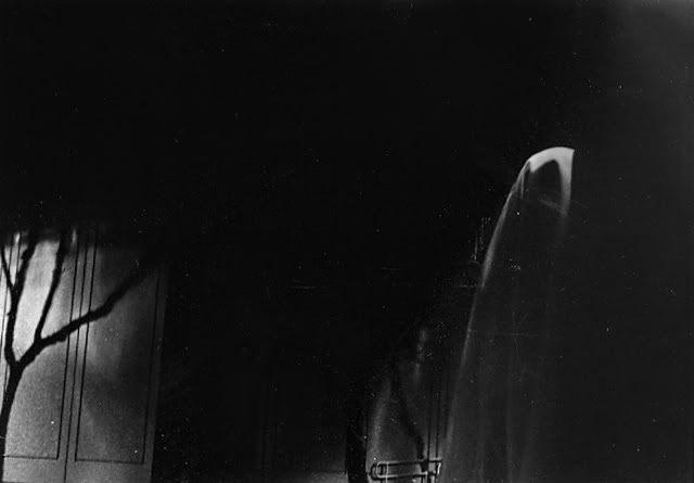
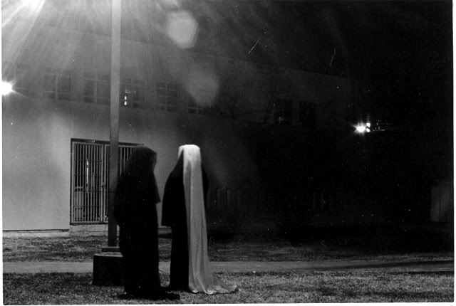
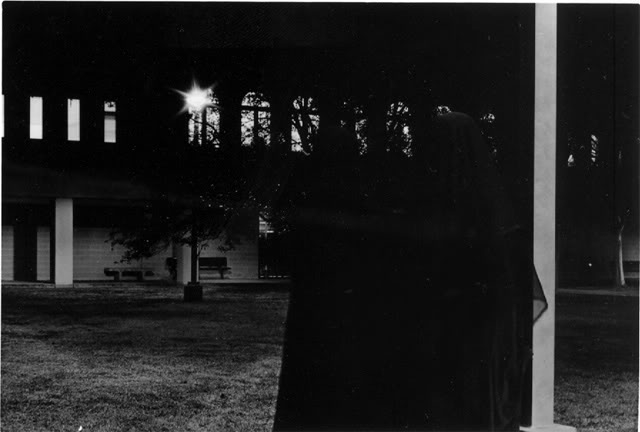
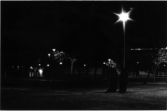
| | Subject: Re: school stuff pt. 2 Tue Mar 03, 2009 9:57 pm | |
| | |
|
| | |
brent
Number of posts : 9
Registration date : 2008-08-15
| | Subject: Re: school stuff pt. 2 Tue Mar 03, 2009 10:09 pm | |
| those are really neat. especially the night ones. | |
|
| | |
Cath
Number of posts : 272
Registration date : 2008-08-12
| | Subject: Re: school stuff pt. 2 Fri Mar 13, 2009 9:43 am | |
| | |
|
| | |
deudbus

Number of posts : 174
Age : 34
Registration date : 2009-02-06
| | Subject: Re: school stuff pt. 2 Fri Mar 13, 2009 11:51 am | |
| | |
|
| | |
Sponsored content
| | Subject: Re: school stuff pt. 2 | |
| |
|
| | |
| | school stuff pt. 2 | |
|